Details page
Use running text, images, and other content components to provide more detail about a topic
Overview #
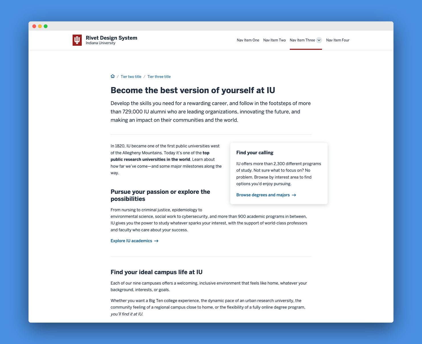
The details page layout is designed for longer-form text content that provides detailed information about a topic. The optional feature slot and breakout elements can be used to help important content stand out from the rest of the page.
Screenshots #
Features #
The details page layout comes with the following:
- Single-column and two-column variants
- Breadcrumb navigation
- Prominent page title and optional subtitle or summary
- Support for a feature slot element
- Support for breakout elements
- Support for all built-in Rivet components and utilities
Usage #
The details page layout supports a feature slot element and breakout elements.
Feature slot element #
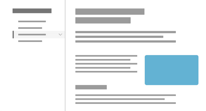
You can add the .rvt-layout__feature-slot CSS class to the first child element within the .rvt-layout__content column to set that element off from the rest of the page content. Running text will flow around the left side of this element on wide screens.

The optional feature slot element can be used to highlight an image, important information, or a call to action at the top of the main content area.
<main class="rvt-layout__wrapper">
  <div class="rvt-layout__sidebar">
    <!-- Your sidebar content -->
  </div>
  <div class="rvt-layout__content">
    <!-- Your main page content -->
    <div class="rvt-layout__feature-slot">
      <!-- The content in this feature slot element will be aligned to the top right of the main content area -->
      <p>Some important content.</p>
    </div>
  </div>
</main>
Do
- Use only as the first child of
.rvt-layout__content - Use to highlight important information or a call to action
- Use to add visual interest to a page intro with an image or illustration
Don't
- Use more than one feature slot element per page
- Use outside of the main content area (
.rvt-layout__content)
Breakout elements #
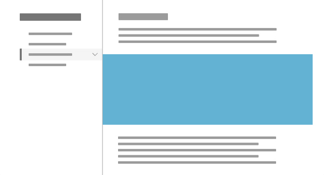
You can add the .rvt-layout__break-out CSS class to an element within .rvt-layout__content to make that element extend all the way to the edges of the main content column. A breakout element has no left or right padding.

Breakout elements are useful for highlighting compelling images or content sections that you want to call out within a column of running text. You can add a background color to a breakout element using Rivet’s background color utilities.
<main class="rvt-layout__wrapper">
  <div class="rvt-layout__sidebar">
    <!-- Your sidebar content -->
  </div>
  <div class="rvt-layout__content">
    <!-- Your main page content -->
    <div class="rvt-layout__break-out">
      <!-- This image will be wider than the rest of the main content column -->
      <img src="...">
    </div>
  </div>
</main>
Do
- Use to highlight a compelling image
- Use with a background color to call attention to an important content section
Don't
- Use more than one or two breakout elements per page
- Use outside of the main content area (
.rvt-layout__content)

